RU
Packaging Label Design
Client: A La Carta
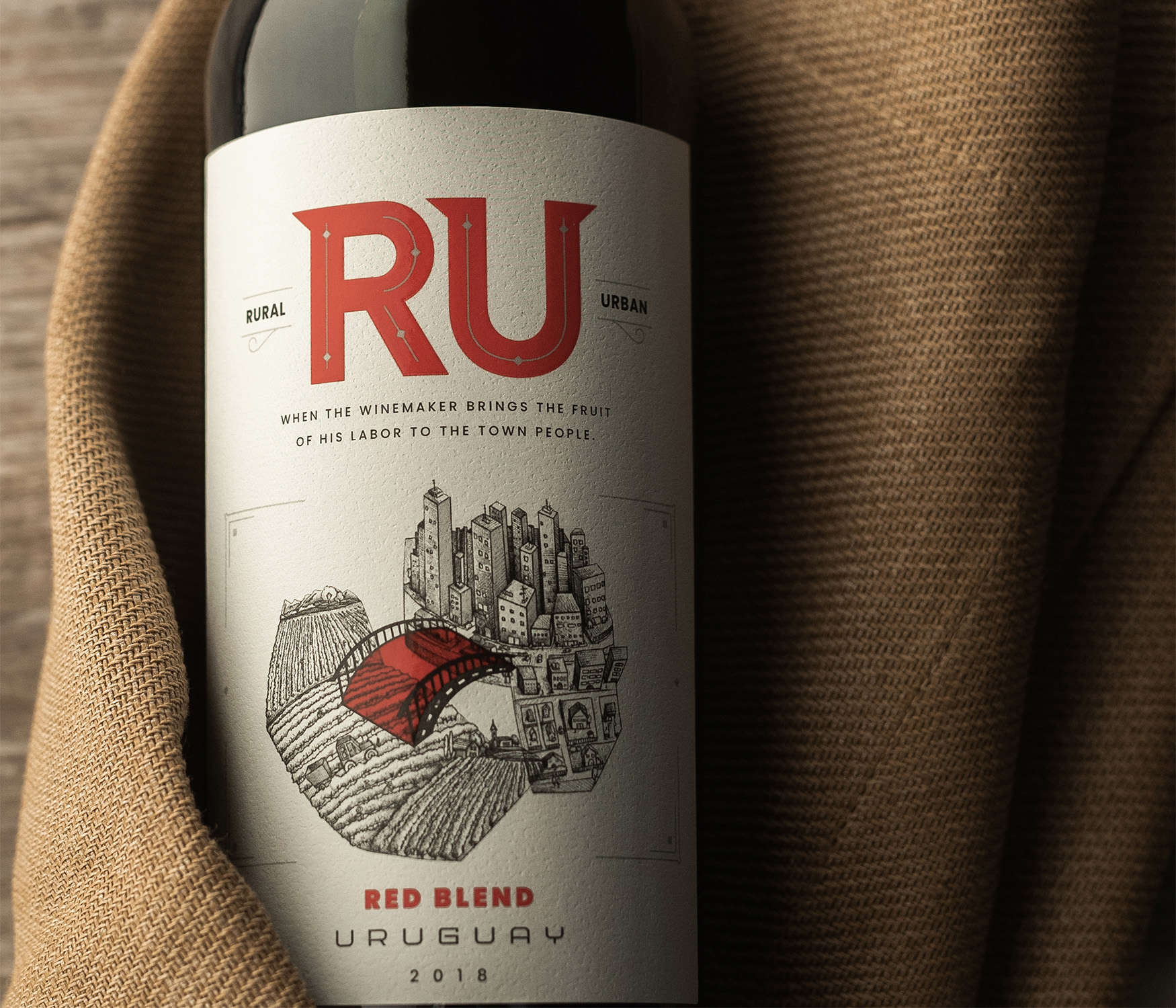
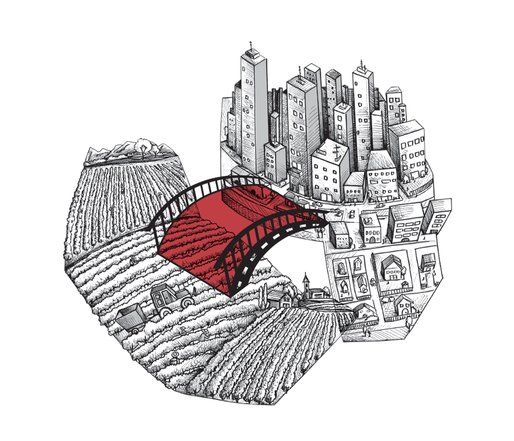
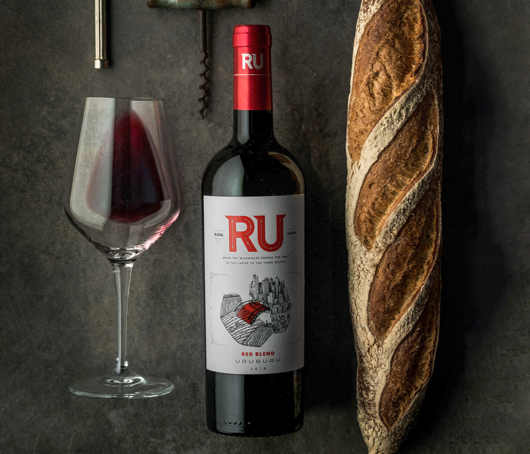
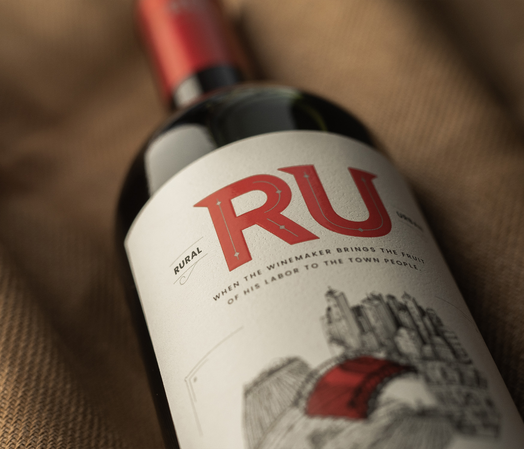
For a producer in Uruguay, EZI was was given the task to design the branding, narrative approach and label design for a brand new product. RU is the bridge between rural and urban. The winegrower who wishes to transmit his passion and share the fruit of his labor with the city people. It is both worlds colliding; the letters R (rural) and U (urban) linked in a single word like the gathering of labor and the happiness of tasting the wine of this labor. To highlight this concept, the main element of the packaging is an original illustration with the main asset being a red bridge that creates the link between rural and urban areas.