RTDs (ready-to-drink cocktails) and premium cans are booming because they meet a simple expectation: quality + convenience.
A design guide for premium RTD cocktails and cans: hierarchy, thumbnail legibility, range architecture, and best practices to win both on shelf and online. But from a design standpoint, a can is a demanding format: small surface area, intense competition, fast purchase decisions, and digital visibility.
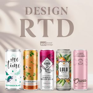
The Rules of RTD Packaging That Converts
- Brand name + product type readable in 1 second
- Flavor/variant clearly identifiable
- ABV visible (or “0.0%”)
- One iconic element (symbol, pattern, mascot)
- A coherent range system (clear color coding)
Typographic Hierarchy: The Secret of Premium Cans
On a can, there’s no room for everything. An effective hierarchy looks like this:
- Level 1: Brand
- Level 2: Type (spritz / highball)
- Level 3: Flavor
- Level 4: Proof points (ingredients, “real fruit,” “crafted”)
Clarity wins.
Visual Styles That Work (2026)
- Simple, iconic illustrations
- Repeating patterns (recognizable from a distance)
- High-contrast minimalism
- “Craft signals” (texture effects, engraving, micro-details)
- Limited series (distinct colorways)
Multi-Pack = Marketing Tool
A strong multipack isn’t just a box, it’s a mini billboard on shelf.
It should tell the range story, clarify the benefit, and create a strong value perception (discovery pack, variety mix, seasonal edition).
Launching an RTD? We can help you design a can that stands out, converts online, and scales across a full product line.
Let’s create your next brand, together.